

ING App
ING is a banking app I use daily and have relied on for over five years. While I appreciate its overall functionality, my recent deep dive into accessibility opened my eyes to areas where the user experience could be improved.
This inspired me to redesign five key screens, focusing on improving accessibilities; contrast, navigation clarity, text readability, and visual hierarchy. Rather than reinventing the app, my goal was to explore how small, thoughtful adjustments can help make an already strong experience even more intuitive and inclusive.
Project Type
Solo Project
My Role
Product Designer
Timeline
2025
🎥 New Design
📝 Notes
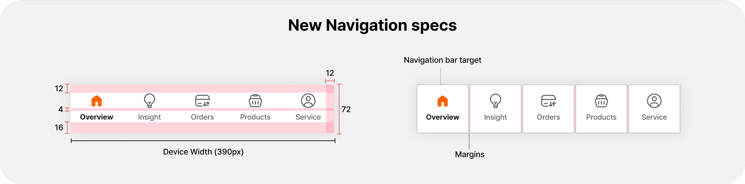
Bottom Navigation Bar
Observation
When I ran a greyscale test on the existing bottom navigation, it became clear that the selected and unselected states were not so clear to distinguish. Below are the normal and greyscale versions of the original navigation bar:

The current bottom navigation relies solely on colour to indicate which tab is currently selected. According to WCAG guidelines (2024), this creates an accessibility issue for users with colour vision deficiencies. To meet accessibility standards, it’s important to include additional visual cues beyond colour to communicate states effectively.
Icons & States
While the current navigation bar depends on colour to differentiate, the icon for the Service tab alone has a different style. Depending on their state, icons should have the same style (e.g., filled or outlined).

Icons give the dominant cue of the navigation state. Therefore, it’s recommended to use a filled icon for selected destinations and outlined icons for non-selected destinations (Material design, n.d.).

Now it’s easier to distinguish the states, even in grayscale. As for the labelling system, all text labels were simple and noun-based. I assumed they were the result of the team’s research and decision-making, so I kept them as they were.
Top Navigation Bar (Header)
Observing the Current Layout
While exploring the top navigation across the five main tabs, I noticed that most headers followed a fairly consistent structure. However, the centred title looked slightly off-balance, since other pages didn’t have icons on the left side.


Icon Meaning & Consistency
The logout icon could be a bit confusing for some people, and if it’s clicked, the user will be logged out right away without being asked. Moreover, since I wasn’t fully sure about the reasoning behind the logout icon’s prominence on the header, I decided to move it to service screen (as service has elements related to account), while still keeping it accessible.

Since these pages are all part of the same core experience, I felt that aligning the structure across them could help create a more predictable and user-friendly layout. So, I proposed a simple adjustment: placing the title on the left and any icons on the right for all main screens.
Overview
From the top
First, under the search bar, there are four buttons. While reviewing these, I noticed a few areas for improvement:
The text labels were a mix of noun-based and verb-based styles.
One of the buttons, “Invite a friend,” had a much longer label than the others, causing it to be taller and disrupting the visual balance.


To create a more cohesive and consistent look, I updated the button labels to:
Follow a verb-based style, which is generally recommended for clarity and consistency.
Use labels of similar length to ensure the buttons have equal height and feel visually balanced.
Visual Consistency & Accessibility in Section Layout
Most elements on this page were grouped in white containers with an orange title and icon, giving them a clear and consistent visual structure. However, I noticed a few inconsistencies:
The “Cards” section stood out. It didn’t follow the container style. The title was in black instead of orange, and there was no visual box around it.
I assumed this might be intentional, since the section already includes cards (like “Debit cards” and “Apply for product”), and a “card inside a card” layout could be not the best idea.

While reviewing this page, I first asked myself: “As a user, what do I want to see first?”
From a content perspective, the “Current Accounts (My accounts)” section felt like the focal point. So there were two choices (image below) but for now, I selected B.

✍️ Accessibility Improvements
The current titles were in orange on a white background, around 20px, with medium or semi-bold font weight (depending on the typeface). I checked the contrast ratio, which came out to approximately 3:1 — this meets WCAG AA, but only if the text is bold.
Since I wanted to aim for WCAG AAA compliance (minimum 4.5:1), I increased the font weight to bold and adjusted the icon thickness to visually match the text’s strength. This small change improves both accessibility and visual hierarchy.
Insight
From the top
Like the Overview page, the Insight page also has buttons at the top. Right now, the button labels are verb-based, and the first one takes up two lines, which makes the layout look unbalanced.

Since ING seems to be adding more buttons (for example, the Overview page used to have three, now it has four), I assumed they might add more here too. Because the labels are long, I imagined another button with a similar-length label and spaced them out evenly to keep the layout balanced.

Overall Layout & Structure
The insights shown are based on two things: 1) the selected account and 2) the selected period. Since all the financial insights below depend on these two, I grouped the selected account and selected period together at the top. Everything else below is about the user’s spending and activity for that month, so I kept them on the same level.


⭐️ Before & After
Overveiw


Insight


Orders


Products


Service


Reference
WCAG. (2024, April 16). Technique G182:ensuring that additional visual cues are available when text color differences are used to convey information. https://www.w3.org/WAI/WCAG22/Techniques/general/G182.html
Material Design. (n.d.). Navigation Bar – Material Design 3. https://m3.material.io/components/navigation-bar/accessibility